Sometimes you have content for a lens that’s best presented in a table. But Squidoo doesn’t allow HTML <table> tags in any modules.
Fortunately, there’s the SquidUtils Table Generator developed by lensmaster thefluffanutta to help you build custom tables for your lenses.
It’s a simple tool that works well. Tell the generator what format your data is in, paste in your data and choose your style options. (The color fields for Border and Shading apply to all of the options, not only the last one.)
Press a button and the tool shows you a preview of the table with your data and gives you the code to copy. The preview makes it easy and quick to experiment with different options. When you’re happy with how the table looks, copy the code and paste into a text module on your lens.
Now that your data is in a proper table, you can publish as is or customize the formatting even more if you want. A few ways you can do this are to bold or italicize text, add hyperlinks and adjust the cell widths.
Here are two examples of how I’ve used and customized the generated table code…
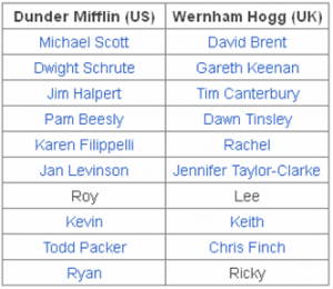 On my Office TV Show lens, there’s a two column table that matches characters from the UK version of the show with their counterparts on the US version. The table generator settings for this were Border: Boxes; Border Color: black; Shading: None; Alignment: Center.
After copying the generated code into a text module, I modified it by bolding the header row text to help that stand out. Then I added hyperlinks for most of the character names. The links help readers find more info about each character and potentially increase clickouts.
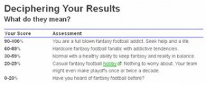 My Fantasy Football Addiction Test has a table to tell readers what their score means. The generator settings for this were Border: Header; Border Color: blue; Shading: None; Alignment: Left.
I customized this table by bolding the text in the header row and all of the scores in the first column. Since the text in the left column is shorter than what’s in the right column, I adjusted the width settings of each cell (width:140px and width:440px, respectively). This balances the table and allows enough room for the longer text in the right hand column.
Now go have fun adding tables to your lenses…

 On my
On my  My
My 